


Marek Pražák on the visuals of the Smetana Opera Cycle Ostrava 2024
"When creating the logo for the Smetana Opera Cycle Ostrava 2024, I concerned it from many aspects and stepped into two design phases. There was a consensus for the logo with a B. Smetana portrait or a geometric symbol with a font. The logo with a portrait won out because it leads to immediate identification of the event with the personality of B. Smetana and also contains emotion in colour and facial expression. The cycle is symbolised by the circular arrangement of the logo from the central point - the likeness of B. Smetana, as the primary cell of Czech music. The cell—a circle with a red field containing the likeness—follows the NMST’s manual so that the logotype is compatible and can be developed in terms of colour, signs, and composition. Circular fields are derived from the centre and carry information: blue - the name of the event, white - the individual opera titles, the website, detailed and specific information about them, etc. The white circle can be 'inflated' and modulated as needed. The colour of the logo has symbolism in the colour of the Czech statehood. The logo is designed to be clearly legible, dignified and variable in the long term."
"When creating the logo for the Smetana Opera Cycle Ostrava 2024, I concerned it from many aspects and stepped into two design phases. There was a consensus for the logo with a B. Smetana portrait or a geometric symbol with a font. The logo with a portrait won out because it leads to immediate identification of the event with the personality of B. Smetana and also contains emotion in colour and facial expression. The cycle is symbolised by the circular arrangement of the logo from the central point - the likeness of B. Smetana, as the primary cell of Czech music. The cell—a circle with a red field containing the likeness—follows the NMST’s manual so that the logotype is compatible and can be developed in terms of colour, signs, and composition. Circular fields are derived from the centre and carry information: blue - the name of the event, white - the individual opera titles, the website, detailed and specific information about them, etc. The white circle can be 'inflated' and modulated as needed. The colour of the logo has symbolism in the colour of the Czech statehood. The logo is designed to be clearly legible, dignified and variable in the long term."
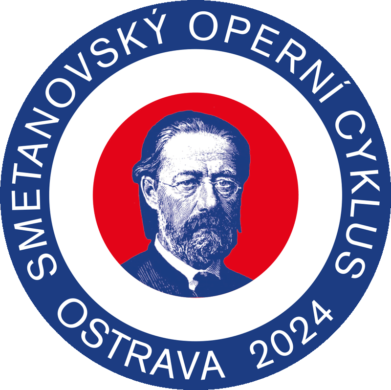 |
1. Basic logo |
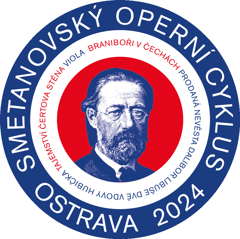 |
2. Logo with the titles |
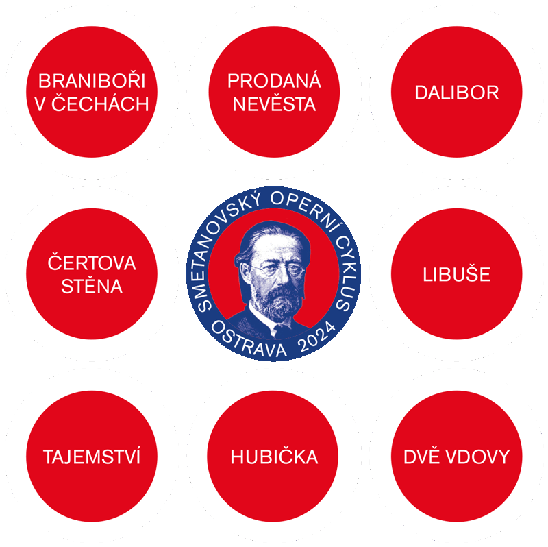 |
3. Logo – website preparations |